June 28, 2026
What colors should you mix for vibrant watercolor?
To make 2 colors vibrate together in watercolor, I pair a warm color with a cool one, choosing them from 2 different quadrants of a warm-cool, vivid-dull matrix. My 3 magic mixes are gamboge with cobalt turquoise, yellow ochre with cobalt turquoise, and burnt sienna with cobalt turquoise. To avoid spreading yourself too thin, keep one color fixed and vary the other.
If you don't know why you're choosing a particular color combination, you're painting completely blind. So here are these 3 mixes, ready to copy and paste into your watercolors, along with the reasoning that led me to them.
Mix 1: how do you paint turquoise water with gamboge and cobalt turquoise?
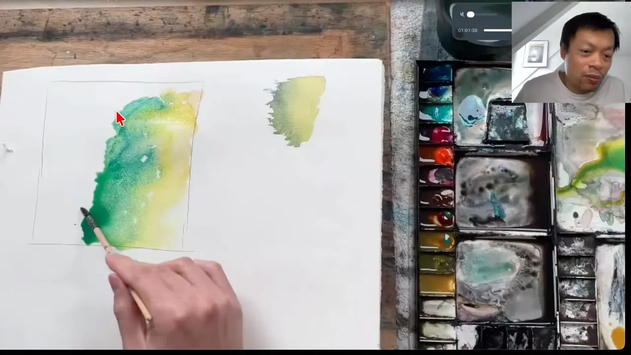
I showed this mix during a session with a student I was mentoring. She wanted to paint a beach photo and didn't know how to capture that turquoise blue water. Her transition from yellow sand to water wasn't bad in itself, and the colors were blending well, but it lacked intensity. I did a demonstration for her, and you could feel the difference in vibrancy between our 2 results.
Here's how I do it:
- I lay gamboge, a very vivid yellow, on the paper with lots of water and lots of pigment, until it's almost a puddle.
- I pick up cobalt turquoise and mix it lightly into the gamboge. It isn't a clean turquoise yet, more of a fairly vivid yellow-green.
- Then I switch fully to cobalt turquoise and carry my wash on until I'm about halfway down the painting.
- At that point, I move to a much heavier load of pigment.
The cobalt turquoise gradually mixes with the gamboge, and you get the effect of a beach seen from above. After showing her how to use this mix, I found it really interesting to compare what she was doing before with what she did once she applied it.
Why pair a warm color with a cool color?
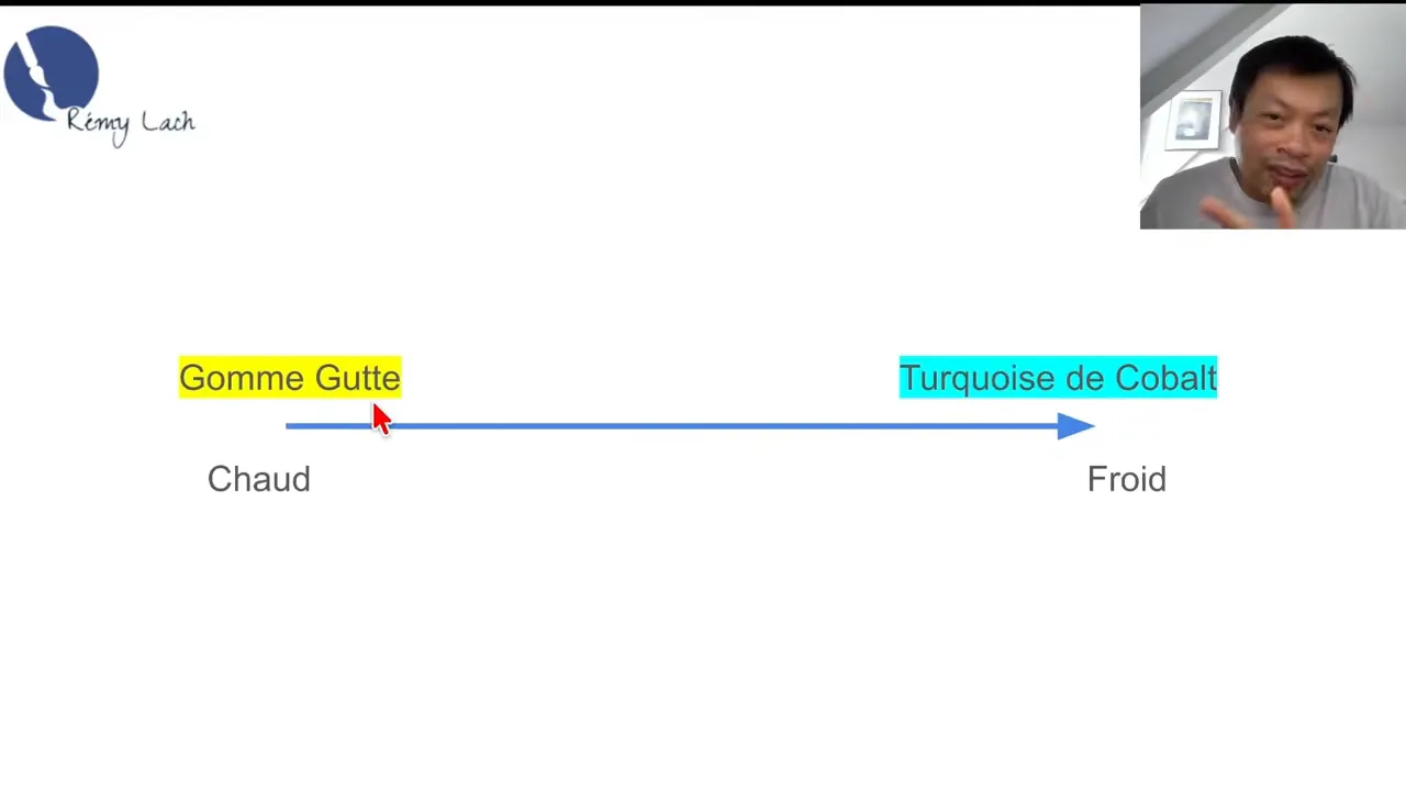
The first factor that made me think of this mix is color temperature. Gamboge is an extremely warm color, and cobalt turquoise is a rather cool one.
This marriage of warm and cool doesn't work every time. Take orange and blue, for example: you have warm and cool, but since they're 2 complementary colors, they'll tend to turn gray. Even so, this first filter is a good starting point for asking yourself what a given pairing might produce.
How do you use the same mix without yellow sand?
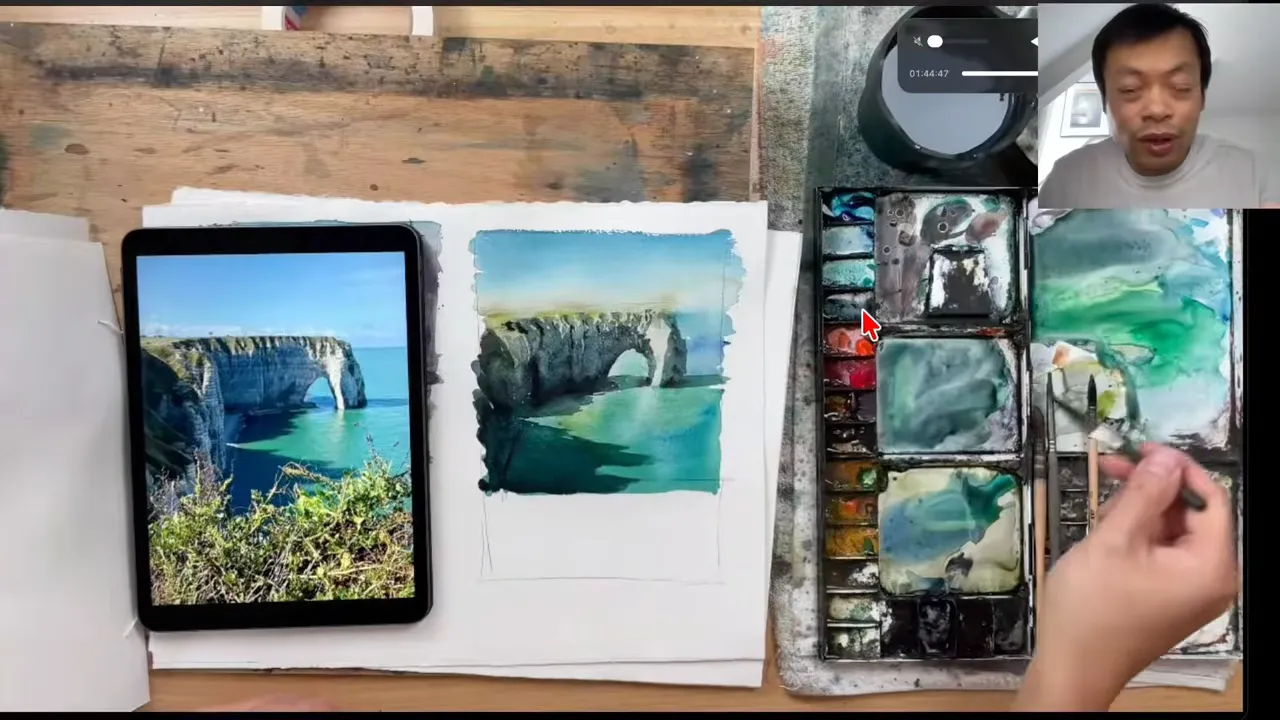
When I painted a cliff at Étretat live with my students, there wasn't really any yellow sand. The combination still worked, as long as I used it differently.
Instead of starting with pure yellow, I first mixed a little gamboge with cobalt turquoise, which turned green. I started with that green. Then, as I worked my way down into the sea, I added more and more of the cool pigment.
This shows that these combinations aren't binary. They sit on a continuum, with lots of gamboge at one end and lots of cobalt turquoise at the other. Since I wanted something leaning more toward turquoise here, I didn't automatically start with pure gamboge. This idea of a continuum is what lets you create an infinite range of shades.
Mix 2: what color should you choose for less flashy sand?
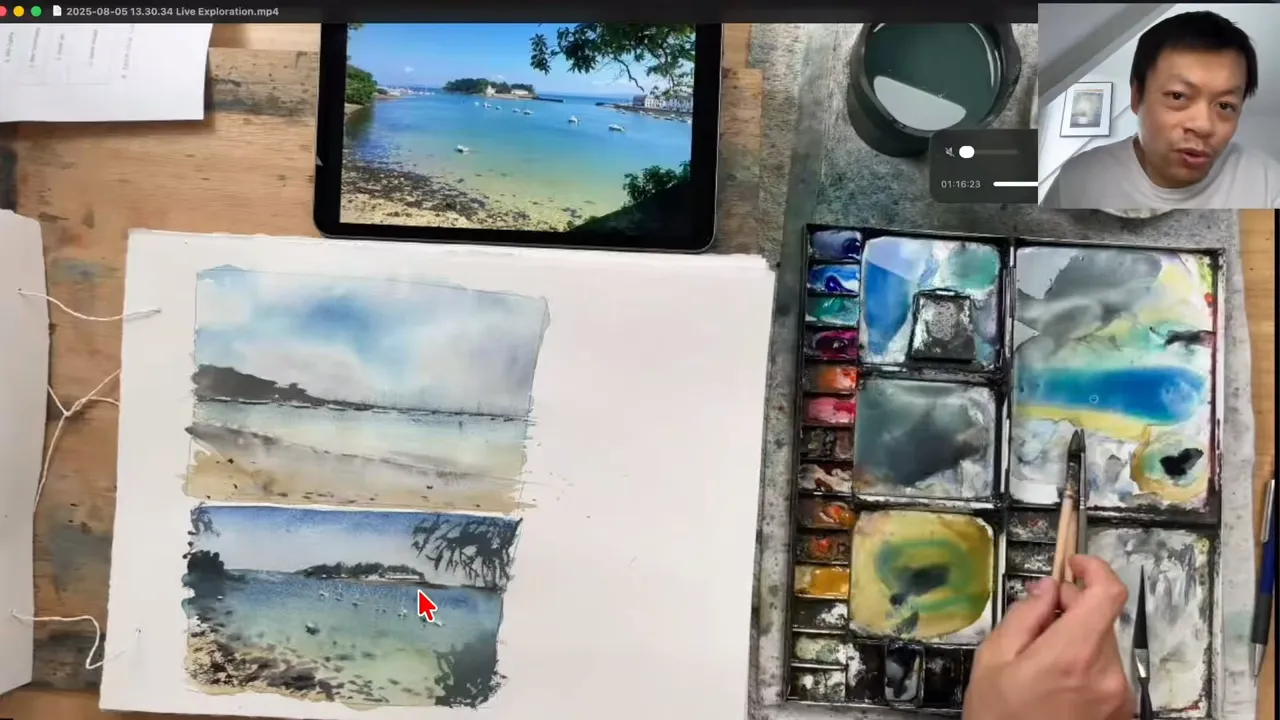
In a workshop, we started from a photo of a beach whose sand had a more muted tone. To avoid a flashy yellow, I couldn't use gamboge. So I took a yellow with duller tones: yellow ochre.
I laid down yellow ochre generously, then added cobalt turquoise, more and more of it, until there was much more turquoise than ochre. The result is a beautiful transition from the sand to water where you can feel the transparency, then on to slightly deeper water.
This mix is perfect for painting beaches with a yellow closer to the sand color you see more often in real life.
It also brings out my second factor. On top of pairing warm with cool, you're pairing vivid with dull here. Here's where I place these colors in my warm-cool, vivid-dull matrix:
- Gamboge: warm and vivid.
- Yellow ochre: warm and dull.
- Cobalt turquoise: cool and vivid.
This is exactly how I try to find color pairings that will vibrate together, by combining 2 colors from 2 different quadrants. You could also pair gamboge with yellow ochre to create other effects, but watch out for the trap: with too many combinations to test, you spread yourself too thin.
Mix 3: what colors should you use for buildings at night?
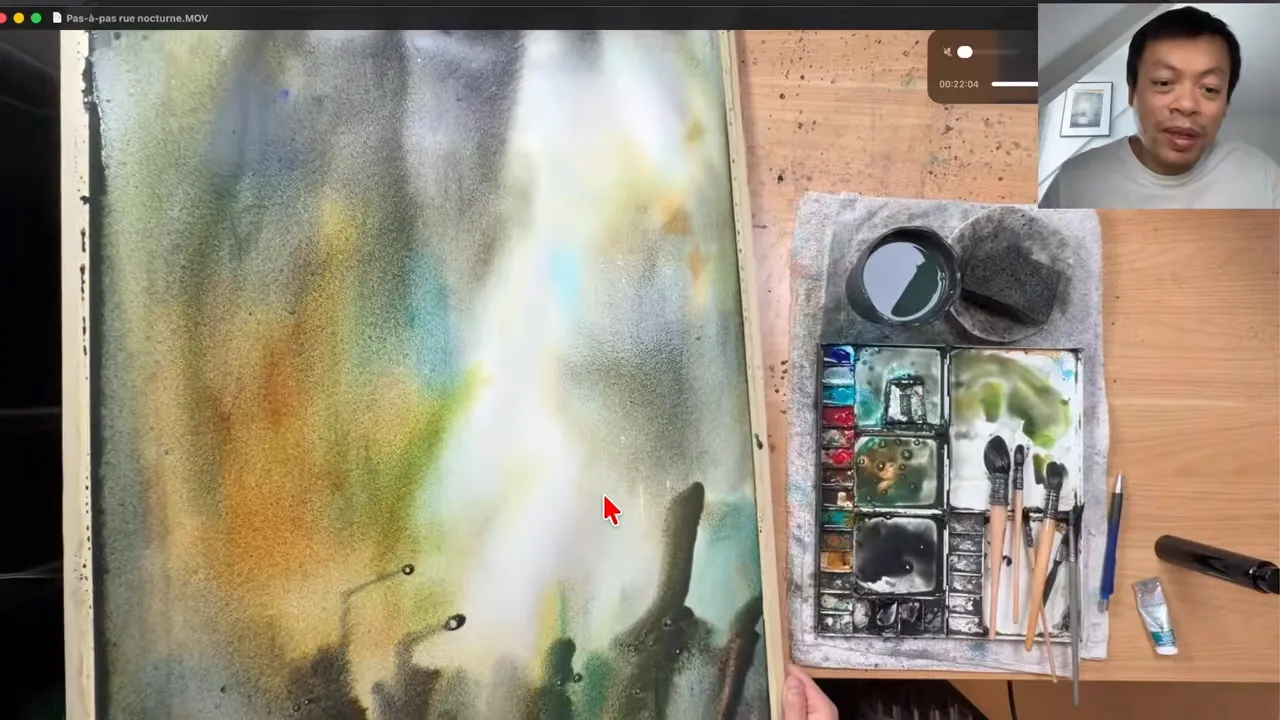
This third mix came from a student's photo of a night scene. The buildings looked a bit yellow and greenish to me, and I wasn't quite sure which color to use to capture that look of stone at night. I painted this subject in a large format, on a 56 by 77 cm sheet.
Here's how I went about it:
- I started with gamboge on the left side, then added cobalt turquoise. That's more or less the first combination again.
- Then I changed tack and laid down a much browner color, burnt sienna. You could also use burnt umber, which is more or less the same family.
- I added another layer of cobalt turquoise, using a huge amount of it.
- I tilted the paper to make the pigments blend.
Once it's dry, you get tiny variations between the gamboge, lightly mixed with cobalt turquoise, and above all the burnt sienna and burnt umber. So this third combination is burnt sienna with cobalt turquoise.
The funny thing is that, for me, burnt sienna goes with ultramarine blue. I had never really tried mixing it with cobalt turquoise, and yet they get along wonderfully. Burnt sienna is a slightly dull orange, so it's a warm color that sits toward the dull quadrant. This matrix is perfect for getting out of the autopilot mode where I tell myself: burnt sienna goes with ultramarine blue, end of story.
How do you find your own mixes without testing 10,000 combinations?
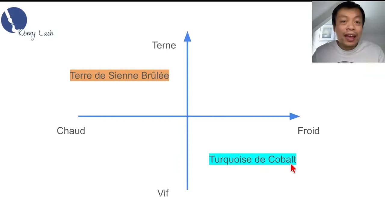
The last criterion, the one that keeps you from spreading yourself too thin, is to keep one color fixed and vary the other. In my 3 mixes, I kept cobalt turquoise fixed every time, and used gamboge, yellow ochre or burnt sienna in turn.
Think of it a bit like a star. Cobalt turquoise is at the center, and from that center, you test different combinations in light of the warm-cool, vivid-dull matrix.
This method has 2 advantages:
- You drastically reduce the number of combinations to test, which makes it much more manageable.
- You discover color combinations you could never have imagined.
FAQ
Why do some warm and cool color pairings turn gray?
Because those colors are complementary. That's the case with orange and blue: one is warm and the other cool, but mixing them tends to give you gray.
What yellow should you use to paint a beach in watercolor?
It depends on the sand you want to paint. With cobalt turquoise, choose gamboge for a very vivid yellow, or yellow ochre for a duller, more realistic sand.
What should you mix burnt sienna with in watercolor?
Ultramarine blue is its most obvious partner, because the 2 work extremely well together. Try cobalt turquoise too: that's the mix I used for buildings at night.
If you want to finally create on your own, with a proven system instead of copying tutorials, this is exactly what you'll find here 👇
Discover The Loose Watercolor System