December 8, 2024
How to stop copying the reference photo in watercolor
To stop copying the reference photo in watercolor, I make all my choices through 3 criteria: intention, readability and feasibility. For each element of the photo, ask whether it serves your intention, makes the painting more readable and is technically doable for you. These answers tell you what to keep and what to remove, so the painting becomes your own.
Why start with which whites to save?
When we take a picture that we want to interpret our own way, we sometimes get bogged down in the details and end up stuck in the photo.
This methodology came from a live session with my students. One of them asked me: how do I know which white to save in watercolor, and how do I anticipate it? So I took a photo from a student, taken in France, and asked: which white from this photo do you want to save?
The answer to that question is also how you detach from the reference photo.
Criterion 1: does it serve your intention?

My students first suggested saving the white on top of a wall. When I asked why, they said it was in perspective and added depth to the painting. That was right, but it was only part of the answer.
One student then asked whether all the whites we save need to create depth. It didn't feel right to me, so I zoomed out and asked what depth and perspective actually bring to a painting. They bring intention.
- If your intention is to create depth and perspective, it's good to leave this white.
- If your intention is just to paint this house or building, you don't need it at all.
So it really depends on your intention. But when my student asked whether all the whites must serve her intention, something still felt wrong. It couldn't be only the intention, and that's when I came up with the 2 other criteria.
Criterion 2: does it add readability?

The second criterion is readability: does this white help the viewer understand the painting?
In the photo, I asked myself whether it was the right decision to save the white for a little pathway. I think so, because it adds readability to the painting. It's the same with the little supports in the scene: if they add readability, save those whites. If not, you don't need to.
A tree sitting just beside the wall shows the other side of this question. You might think you need to save the white for it, and it's true that it shows there is a tree. But if you look closer, does it really help the viewer see that there is a wall and a shadow? Doesn't it hide the shadow instead?
Based on that, you can choose by yourself and stop listening to all the tutorials out there. If the white doesn't add much readability or convey the right message, consider not trying to save it.
Criterion 3: is it technically feasible?

The third criterion is feasibility: on the execution side, is it doable to save this white?
Take the same wall and tree again:
- The wall: saving this white is pretty easy, because you just have to paint negatively around it.
- The bright part of the tree: this is much more complicated. You have to go around the shape of the tree, and then you still have to work out how to paint the shadows of the tree and the wall.
Saving the tree's white isn't impossible, but it's difficult. Since it isn't that feasible, you can decide not to save it.
How do these criteria work on a real painting?
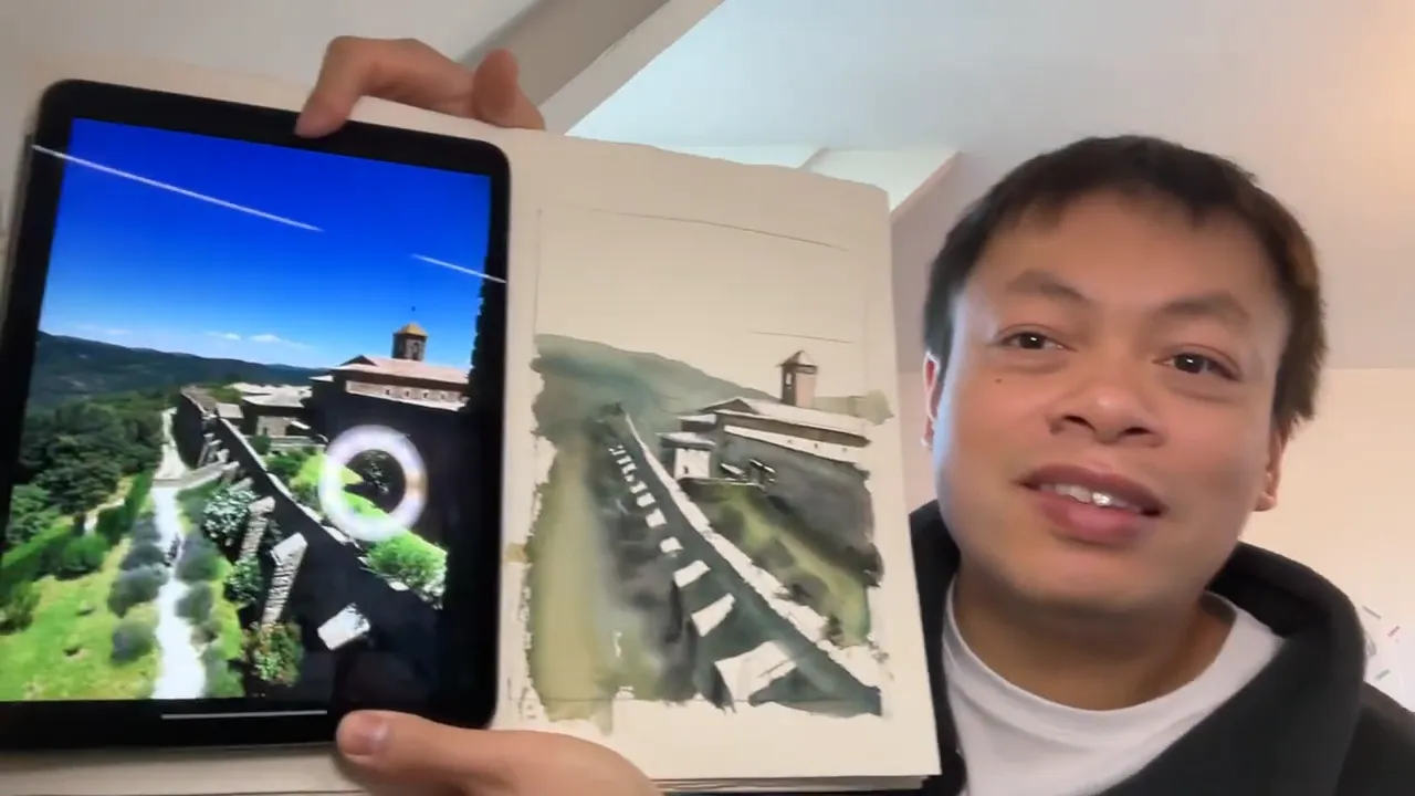
At the end of the live, I painted a little scene based on the photo as a test. I made every decision based on the choices we had discussed about the whites. I saved the parts we had settled on, and I didn't paint the tree. It didn't convey the right message, it didn't make the painting more understandable, and it was much more complicated technically.
My students told me that I had succeeded in detaching from the reference photo just by making the choices that felt right to me.
These criteria also go beyond saving whites. You can apply them to color, tonality and all the other technical parts of your painting. For a color, ask whether it's feasible, whether it conveys the right message and whether it adds readability.
Take a snowy landscape. Warm colors can make it more complicated to understand that the scene is about snow. They aren't impossible, but it's sometimes better to choose a cold color, because it's fresh and cool. It conveys the right message and makes the snowy landscape more understandable.
Why are the right choices different for each painter?
The answers depend on each individual. I have a certain level of technical skill in watercolor, but it's not the same as other artists or my students. Some of my students are more skilled than me technically, and some are less. So the answer to "is it doable?" won't be the same for everyone.
Ask yourself these questions:
- What intention do I want to convey, and what message do I want to tell through my painting?
- Does this choice make the painting more readable and understandable?
- Is it doable with my current technical skill set?
In that way, you can make your own choices in watercolor, detach from the reference photo and make a painting that really comes from you.
FAQ
Do all the whites I save need to create depth?
No. Depth is only one reason to save a white, and it only matters if depth is what you are after. A white can also earn its place because it makes the painting easier to read, like a little pathway.
Can I use these 3 criteria for more than saving whites?
Yes. They work for any choice you face when you make your own version of a photo, whether it concerns a color, a tonality or a white.
Why might another painter make different choices from the same photo?
Because the answers are personal. A white that is too difficult for one painter may be easy for another, and each painter has their own message to tell.
If you want to finally create on your own, with a proven system instead of copying tutorials, this is exactly what you'll find here 👇
Discover The Loose Watercolor System