April 30, 2025
How to paint a sunset over the sea in watercolor
To paint a sunset over the sea in watercolor, I rely on 4 keys. First, keep your colors consistent. Second, make a soft transition from the warm glow to the cooler top of the sky. Third, paint the sky and the sea in one pass, with a sea that is darker and a little less vivid and reflects the sky. Fourth, add vegetation with light shining through it. The main difficulty is blending the warm and cool areas of the sky so they don't look completely separate.
How do you interpret a sunset reference photo?
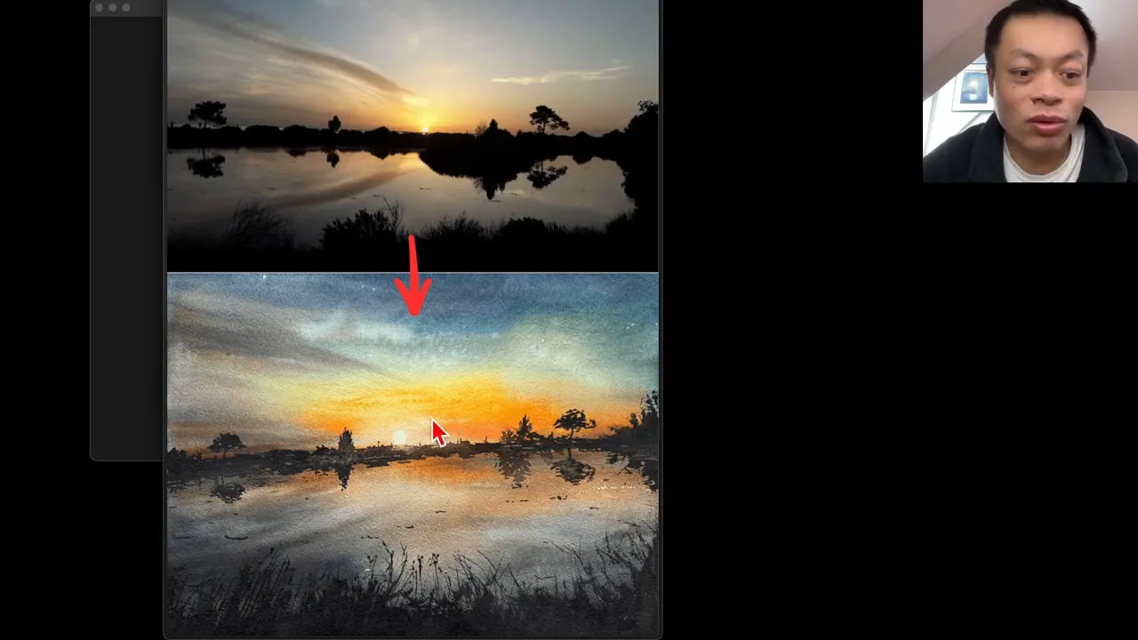
I started from a photo of Arcachon Bay, in the southwest of France, taken at the end of the day. That evening mood is what I wanted to capture. I interpreted it in 2 ways:
- I reframed it. The photo was fairly panoramic, but I usually paint on a quarter sheet, close to A4 or letter size. I cut out the parts that interested me less so I could focus on a format that suits me.
- I reduced the black areas. Because of the backlight, the photo showed a big black mass. I didn't want black to take over the whole painting. One student asked if I did it to add more depth. It's true that it does, but that wasn't my original intention.
I also lightened the whole scene compared to the photo. In my experience, a very dark watercolor is much harder to pull off: it often ends up lighter than I expect, especially from an evening photo. I don't think that's a bad thing. If anything, it's one of watercolor's strengths.
What are the steps to paint this sunset?
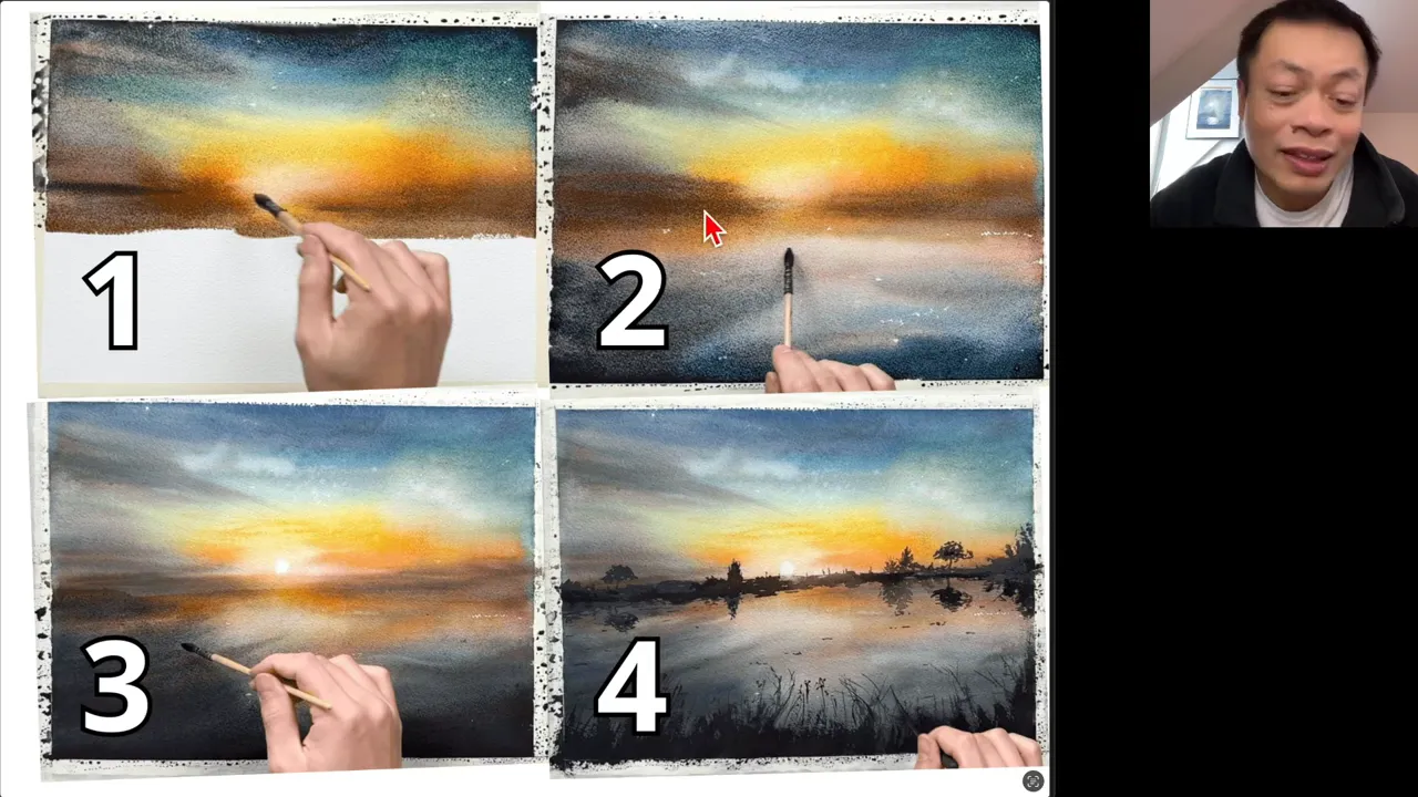
My painting came together in 4 steps:
- The sky. This was crucial, and not that easy, because I had to juggle the warm and cool areas.
- The sea. It looked right to me, but it faded a lot as it dried.
- A second wash on the sea. I glazed a wash with much darker pigment over the lower part only, to darken just the sea. This wasn't planned. I think 3 steps would have been enough.
- The shore, the trees and their reflections, plus a few touches of vegetation in the foreground.
The drawing was just a line and a small circle for the sun. So this painting is ideal if you don't know how to draw.
Should you stick to your pencil plan?
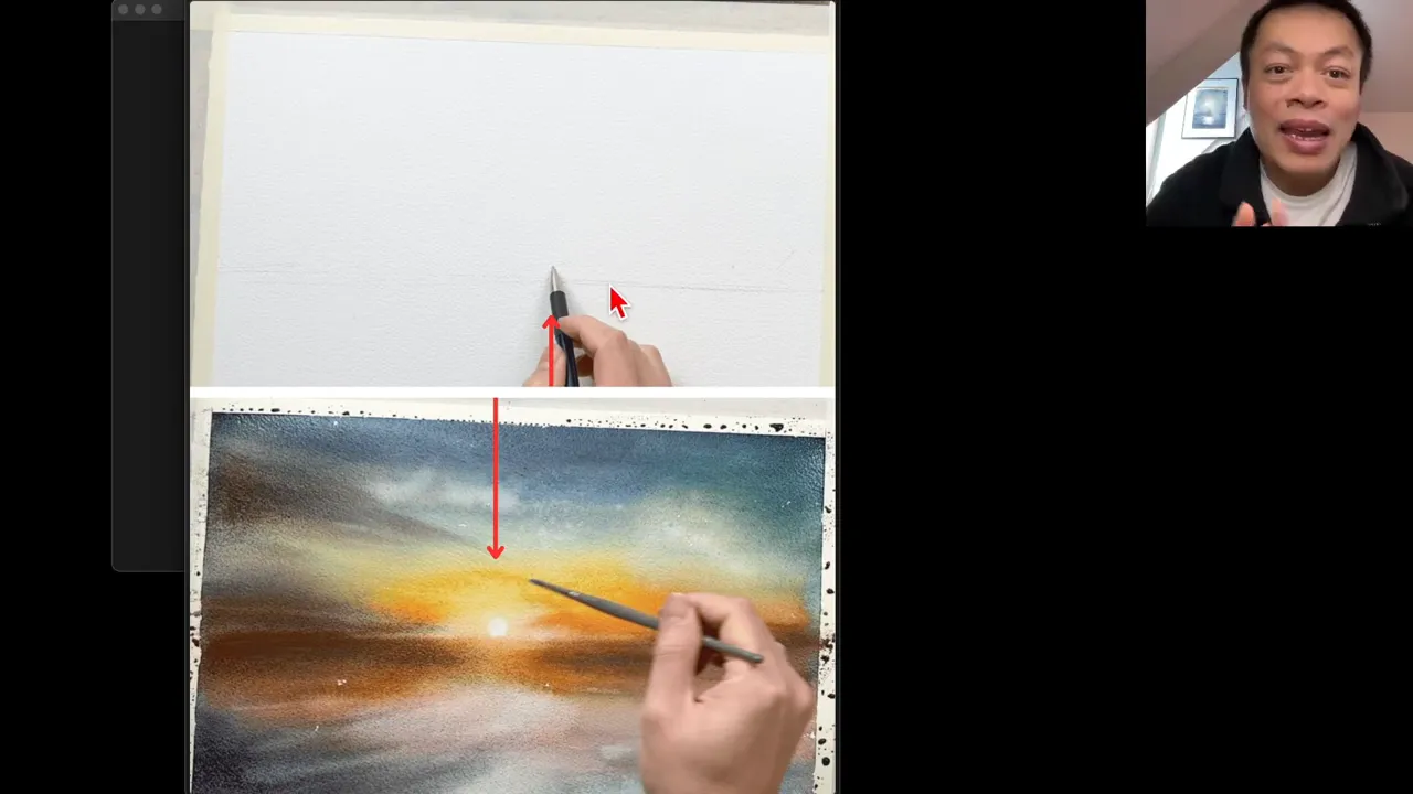
I had placed the sun in the right half, as in the photo. As I painted, the light areas showed up more in the left half. I had completely forgotten about my pencil mark, and I put the sun where the light had appeared.
On another painting, I was so set on following the plan that my sun ended up off from the brightest area. That wasn't the right call. Having a plan still matters: without one, you paint blind and you risk sitting in front of your sheet wondering what to do next. But give yourself permission to leave the plan when the painting calls for it.
What mistakes should you watch for in the sky and the water?
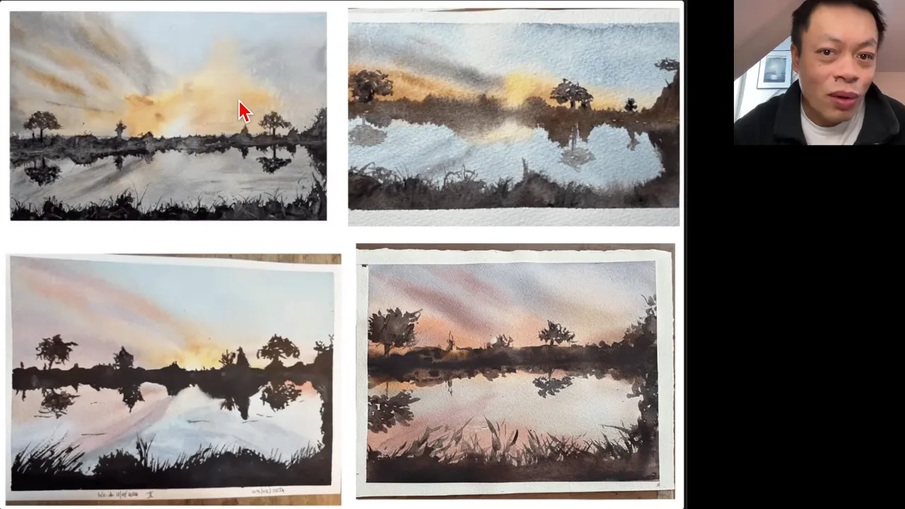
Looking at my students' paintings, I saw some very inspiring things, especially from those who allowed themselves to change the color harmony completely. The areas to improve came down to 2 points:
- The sky. An orange part and a blue part that feel too separate: it's worth aiming for something more harmonious. A sky that's too light looks more like a sunrise. If you want a sunset, you need to correct it.
- The water. Water that's too pale flattens the painting. Water that lacks nuance doesn't reflect what's in the sky.
If you paint this subject yourself, check it against these 2 points: watch the sky, watch the water.
What are the 4 keys to a successful sunset over the sea?
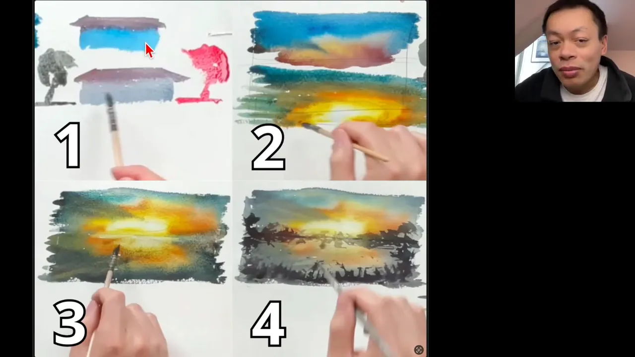
I showed them to my students as what I call watercolor LEGO: building blocks they can then snap together.
- Color consistency. If you paint a roof, then a wall in a completely mismatched color, the painting looks less realistic. If you reuse roughly the same colors with a slightly different hue, you get something much more harmonious. Same thing for a tree: bright red next to the house doesn't necessarily fit. With a color closer to the house, not necessarily duller, it does.
- A soft transition in the sky. Use the color mixes you've already made to move gently toward the top of the sky, which is much darker and cooler.
- The sky and the sea in one pass. Go straight on to the sea, with more muted tones and a stronger value, so overall darker and a little less vivid. Make it reflect the sky, like a mirror: the cloud in the sky shows up again in the reflection. That way you avoid the classic "the sea looks good, the sky looks good, but something's off."
- Vegetation with light shining through it. It's all about how much pigment you load. Since a wash dries paler and duller, don't hesitate to use plenty of pigment.
What if you don't like your sky?
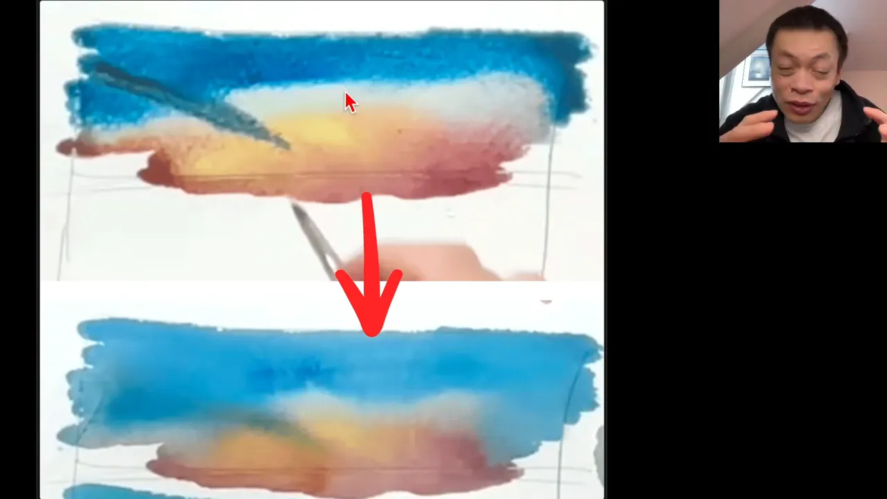
Finish the painting anyway and add the vegetation. Sometimes it completely rescues a sky you thought was ugly at first. You can also paint 6 skies, keep 2 you find really beautiful and 2 you like less, and add vegetation to some of them to see what happens. Some skies are enough on their own.
During my live class, I showed a blue sky with a warm area that was too separate, saying this was what not to do. I left it as it was, without touching it, and moved on. The pigments had time to blend on their own, and the result looked like pink clouds in a blue sky. I could never have predicted it. Separating warm from cool doesn't work for Arcachon Bay, but it's perfect if you want pink and orange clouds standing out in a blue sky: a piece of advice can be wrong in one context and right in another.
FAQ
Why is my watercolor lighter than the photo?
It's very common, especially with a dark or evening photo, because the paint fades as it dries. Load more pigment, and if needed, glaze a darker layer over just the area that needs it.
Should you paint the sea in 2 layers?
It isn't necessary. A second wash adds risk: pigment from the layer underneath can move, and one clumsy brushstroke can ruin the light. It's better to paint the sky and the sea in one pass.
Do you have to match the colors of the photo?
No. Some of my students changed the color harmony completely and the result was beautiful. What matters is capturing the essence of the subject, here the lovely glow of the sky.
If you want to finally create on your own, with a proven system instead of copying tutorials, this is exactly what you'll find here 👇
Discover The Loose Watercolor System