July 25, 2026
How to paint details in watercolor without painting everything
To suggest details in watercolor without painting everything, I use 3 steps. First, observe where the light areas and the dark areas are. Second, paint the shapes of the dark areas without going into the detail. Third, add texture by putting a little more pigment, with very little water, into the darkest spots inside those shapes.
Why focus on one part of the photo?
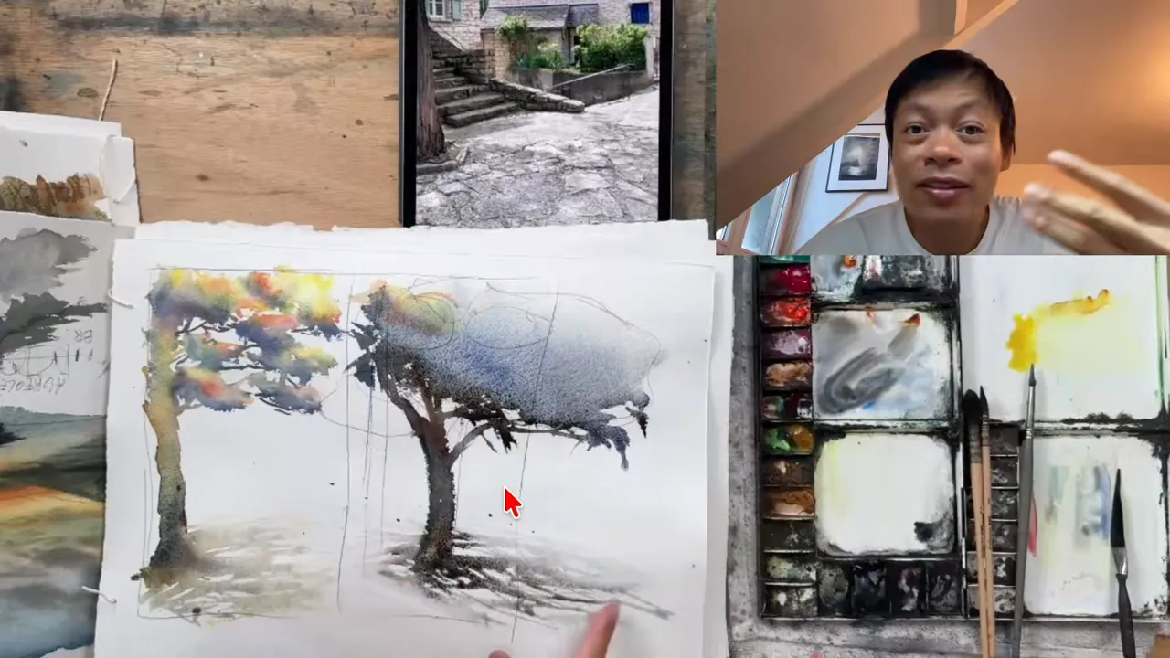
It all started with a photo from a student I coach. She wanted to paint this scene in watercolor: a tree with its trunk, some stairs, and houses behind. With this kind of subject, it's hard to see how to interpret it your way. You want to stick to every single detail: the tree, the trunk, the stairs, the houses in the background.
What I showed my students is that you don't need to paint everything. You can focus on 1 element, for example the tree, and make sure it has a wow effect. You can play with the colors and the light on it, and it creates a wow effect in seconds, just by painting 1 element of the painting.
Then I showed them what happens when you focus on the houses in the background instead of the tree. With a few brushstrokes, the light shines on the houses, and the tree serves the background. When you compare the 2 watercolors, made from the same reference photo, you see that it really depends on which part of the photo you decide to focus on.
My students then asked me: "How did you do that part? I want to create all the trees and all the little details. How do you come up with something that suggests what's in the scene without painting everything?" This is when I shared this exact technique.
Step 1: How do you observe the light and dark areas?
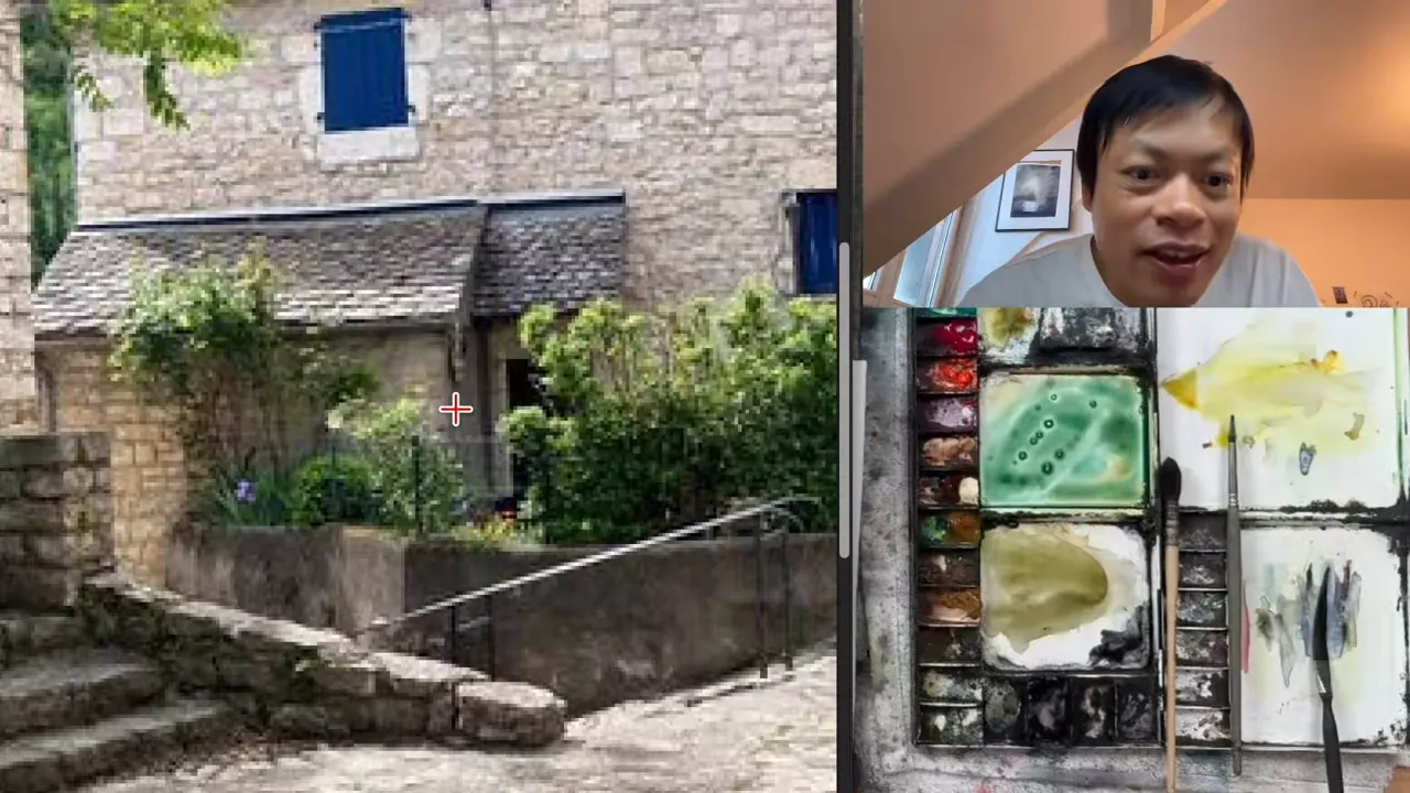
The first thing you need to do is observe how the light shines on the subject. To make things simpler, don't think about the whole painting. Zoom in on the area where you find it difficult to suggest things without going too far into the details.
Then look at where the shadows are, but not only the shadows. What you really need to spot is the difference between the dark areas and the light areas. It's linked to the shadows, but it's more global and more general.
For example, on the house:
- A shadow is a dark area, and the roof is a light area.
- The wall on the side is darker, so it's in the shadow.
- Another wall is also in the shadow, but it's lighter compared with the first one.
That part of the wall is not very light. It's just lighter than the part next to it. By observing where the light areas and the dark areas are, you will be able to spot the shape of the dark areas.
Step 2: How do you paint the dark shapes without the details?
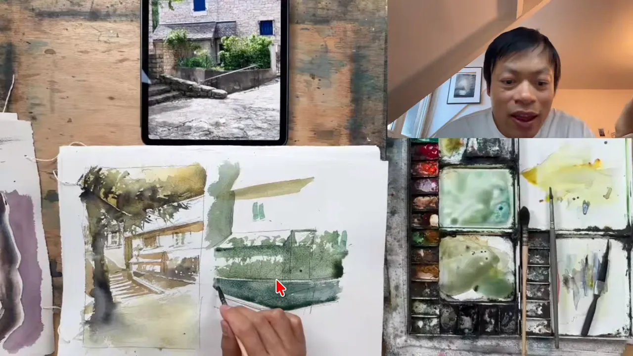
The second step is painting the dark areas. You paint the shape, without going into the detail of the shape.
One of my students asked me why I painted the windows, since windows are not shadows. My answer: you just have to spot the dark areas. The windows are darker than the wall, so you paint them. You could consider that the whole wall is in the shadow, but since the windows are darker, you paint the windows.
Here is what I painted in this step:
- The windows, because they are darker than the wall.
- The shadow under the roof, because it's darker.
- The background, to make the house pop.
- The tree.
- The little wall along the stairs.
On that little wall, I left a thin line of white paper. What I spotted is that the wall is dark, but there is a little bit of light on top of it. So you paint the shape of the wall and you leave the white of the paper for the light on top.
Step 3: How do you add texture to suggest the details?
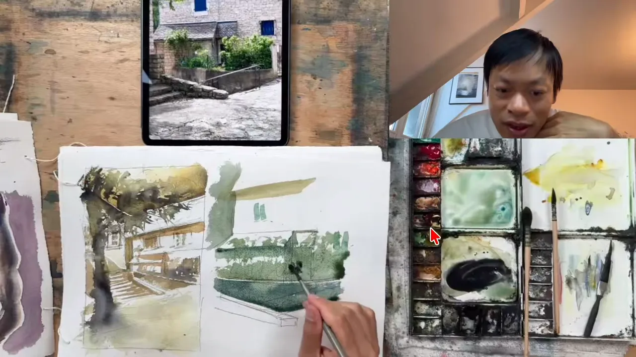
Once you've finished painting the shapes, the third and last step is the texture. You have to identify the darkest areas inside the dark shapes you just painted.
For example, between 2 walls there is a corner that is even darker than the walls. Just under the roof, it's also a little darker. When you spot those darkest areas, put a little bit of pigment without adding too much water, so you keep control of the soft edges you're going to create.
For this, I take neutral tint plus burnt sienna, with more pigment. I put it exactly in those areas, on top of the shape I just painted. This is when you add some texture, a little more tonality, a little more pigment:
- On the wall, where there are darker spots, I put darker pigments.
- The same for the trees.
- I add a little bit of trunk for the trees in front of the walls.
- I add the ramp of the stairs.
By adding some pigment here and there, while letting the first wash breathe behind, you convey something that gives the feeling of a tree. When you look closer, it doesn't exactly look like a tree, but you feel it.
One part is very important. One wall is darker, so wet on wet I add even more pigment. That way you can feel there is another wall, not the same one as the wall beside it. This is how you suggest so many things with very subtle nuances, and it's beautiful in the end, without painting everything. You are just reinforcing some darker areas in your painting.
What happens if you skip the texture step?
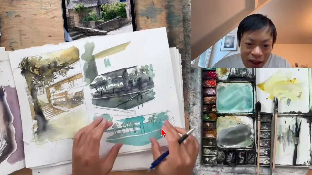
To show my students why this last step matters, I did exactly the same exercise with only step 1, observing, and step 2, painting the global shape, without changing the color and without adding any other pigment.
It still works. You can still feel there is some light, maybe a roof, some kind of house. But without those darker touches, it's very difficult for the eye to understand that there is a wall there, and another wall just beside it.
If you limit the method to the first 2 steps, you will be able to convey some light, but you won't be able to convey the right details. The third step is what lets you convey the whole thing, with all the little details, without painting all the details.
FAQ
Should you paint windows if they aren't shadows?
Yes, as long as they are darker than the wall around them. What counts is not whether something is a shadow, but whether it reads as a dark area.
How much water should you use for the darker touches?
Very little. A drier, more pigmented touch keeps the soft edges under control when you add it on top of the shapes you already painted.
Which colors work for the darkest areas?
I mix neutral tint and burnt sienna, loaded with more pigment, to reinforce the darkest spots of the wall, the trees and the corners.
If you want to finally create on your own, with a proven system instead of copying tutorials, this is exactly what you'll find here 👇
Discover The Loose Watercolor System