August 4, 2025
How to balance your watercolor palette
To balance my watercolor palette, I fix 3 imbalances. First, I control the "palette color", those dried pigment leftovers that dull your mixes, and I add the bright colors that are missing. Next, I check that my palette doesn't lean too far toward cool colors or toward warm colors. Finally, I cut back the color that dominates all my watercolors, which for me was neutral tint.
Why do my watercolor colors look dull?
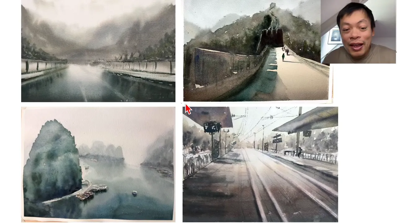
It took me 10 years to understand these 3 points. The first syndrome I ran into was the Terminator. My early watercolors aren't ugly: 4 of them sold at different exhibitions. But they all have one thing in common: they're all dull, while still being luminous.
The main reason is that I was using a 13th color that doesn't exist in my palette: what I call the palette color. It's the leftovers sitting on your palette. Back then, I made a point of never cleaning mine. My mixing wells were cluttered with all sorts of colors, and as soon as I mixed something a little bright, it got dulled by that palette color.
I liked that style, but after a while I felt stuck. Students would tell me: "I really love your watercolors, but they're a bit dull. How can I get slightly brighter colors?" So I started cleaning my palette to keep it pure. That way, even a brown stays a pure brown: burnt sienna, used completely pure, mixed with nothing. My watercolors gained a different vibrancy and energy.
Which bright color is missing from my palette?
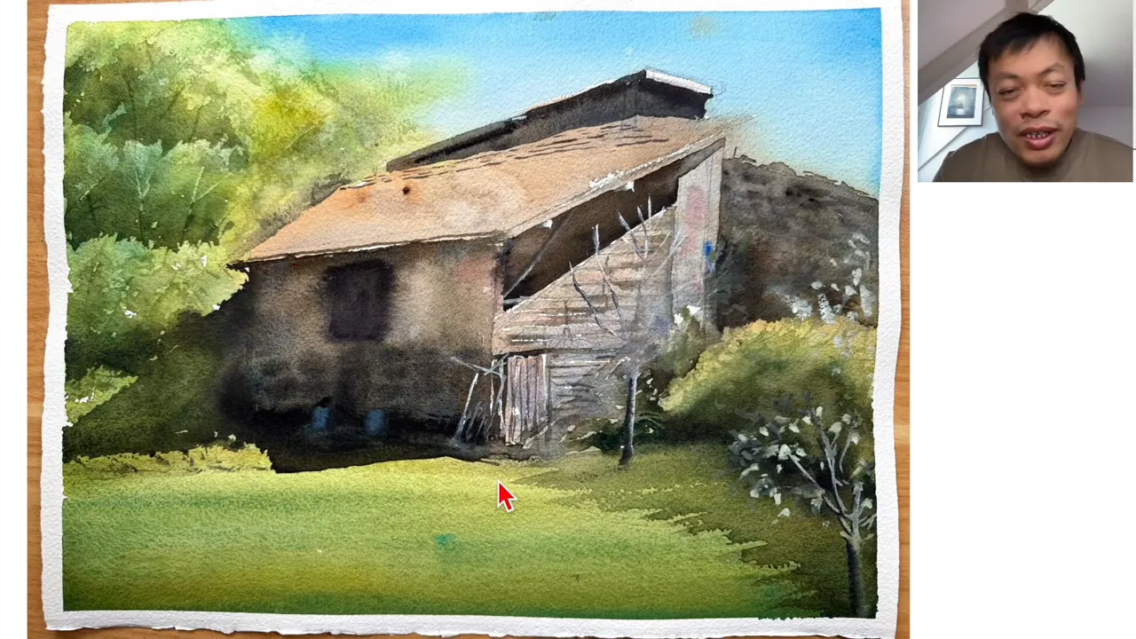
At first, I used alizarin crimson and a lemon yellow, Winsor yellow from Winsor & Newton. Then I discovered Indian yellow, and after that gamboge. I was actually missing a color.
Gamboge let me paint sunsets with a far more vivid yellow than the one I used to get. It also works for lush green landscapes:
- I mix it with cobalt turquoise or with primary blue, and I get a vivid green;
- since that green doesn't exist in a tube, I can mix gamboge with lots of other blues to get many different shades of green.
The goal is to find a balance, not to go to an extreme. I was at the dull extreme. You may be at the opposite one, bright color, locked into clean, pure color. In that case, you may need to cut back on bright colors, bring in a few more muted colors, and even a bit more palette color. It's up to you to judge, based on what your palette looks like today.
Does my palette lean toward cool colors?
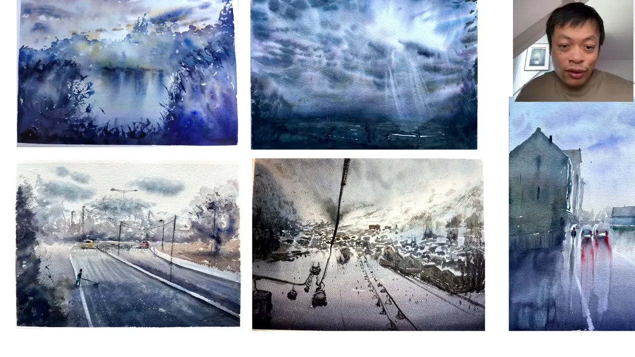
The second syndrome is the Freezinator. Going back through the hundreds of watercolors I painted when I started, I realized that about 3 out of 4 had a bias toward cool colors.
My palette at the time explains it:
- 3 blues: primary blue, French ultramarine and cobalt turquoise;
- only 1 yellow: Winsor yellow;
- on the red side, permanent red and permanent alizarin crimson, which I no longer use: it leans slightly toward violet, so it tends to be on the cool side.
If you can't see your bias in your palette, look at your past watercolors and sort them: this one is rather warm, that one rather cool. What's the dominant color temperature? Don't trust appearances. A twilight going from blue to yellow can look warm, but if the yellow comes from Winsor lemon yellow, that yellow leans cool, compared with a warm egg-yolk yellow, for example.
The day I brought warm colors into my palette, I realized I had cut myself off from a whole range of subjects: watercolors with warm moods. I was able to paint a landscape from a student's photo, interpreted live in front of my students, a night scene with an extremely warm ground, and "Songe d'un crépuscule" (A Twilight Dream), all exhibited at the Carrousel du Louvre.
The real test: if you can paint 2 drastically opposite moods with your one palette, one extremely cold and one extremely warm, your range is wide enough to handle any color mood.
Why are my watercolors too dark?
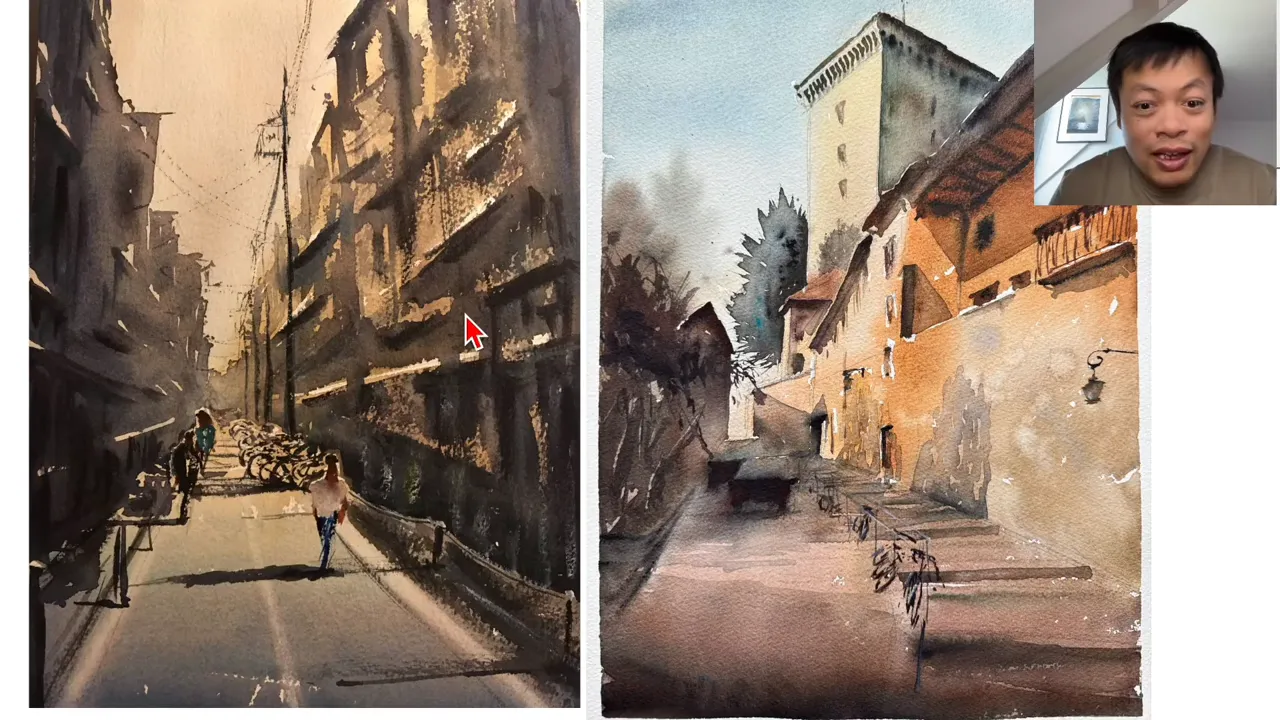
The third syndrome is the Dominator: a color you use so heavily in all your watercolors that it covers 70 to 80% of the sheet. For me, it was neutral tint, a very black watercolor color. I used tons of it. People would tell me: "I really love your watercolors, but they're a bit dark for me."
In an urban watercolor I painted from a photo taken in Japan, there was neutral tint everywhere: in the shadows, the figures, an entire building. The result felt cluttered, almost claustrophobic. A more recent watercolor, where I use it sparingly, looks much lighter, airier and more luminous. I had a bias about light: I wanted ultra contrasted watercolors, without seeing that, paradoxically, by slathering on neutral tint, I was taking light away.
This isn't only true of neutral tint. Lots of people love Payne's gray, a fairly dark blue: if you put it in everything, it creates the same bias.
How do you rebalance a dominant color?
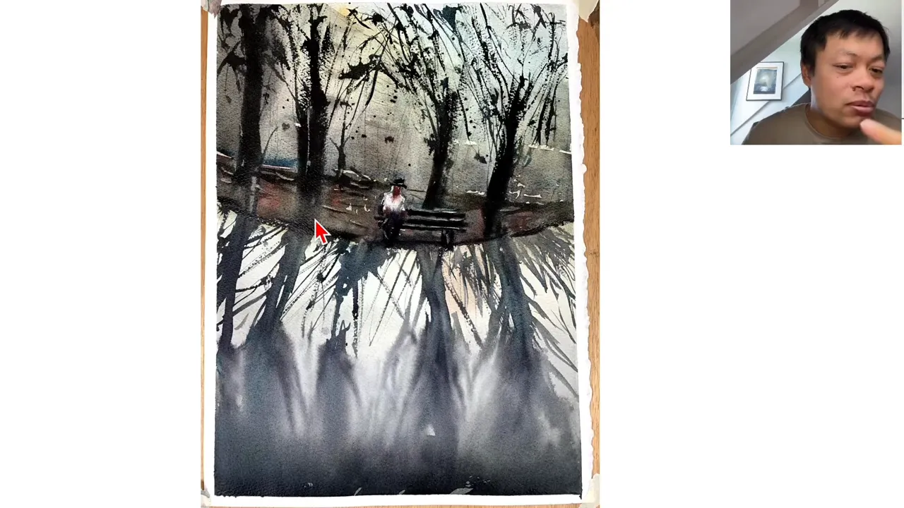
That doesn't mean you should stop using your dominant color. If you use it, it's because it serves your intention. In my watercolor of the lonely man, neutral tint makes sense, because I wanted a melancholic, nostalgic mood. In a watercolor of waves, on the other hand, it comes down to a few surfers and a few areas under the waves.
Here's the approach:
- Go back through your watercolors and look for a dominant color.
- If you use it 80% of the time and everything else 20%, try some watercolors where you flip the ratio. If you only use the rest 20% of the time, your palette may be too cluttered.
- Ask yourself what that color does for you. For me, neutral tint was how I darkened my colors.
- Find a substitute. Mine is burnt umber: an extremely dark brown that warms up a color and keeps you from getting a flat black.
The point isn't to change that ratio permanently, but to ask yourself whether that color is closing doors for you. I didn't stop using neutral tint, I just use less of it than before.
FAQ
Should you always clean your watercolor palette?
No, it isn't a must. For some types of watercolors, it's worth doing. If you're locked into pure color, keeping a bit of palette color can even help you rebalance.
Is a dull watercolor always lacking in light?
No. You need to tell a dull color apart from a luminous one: a watercolor can be luminous and still dull, just like my early watercolors were.
Is neutral tint the same from one brand to another?
You'll find it at Winsor & Newton, the brand I buy from, but also at Daniel Smith and other makers. The formulas vary slightly from one brand to another.
If you want to finally create on your own, with a proven system instead of copying tutorials, this is exactly what you'll find here 👇
Discover The Loose Watercolor System